📖 Table of Content:
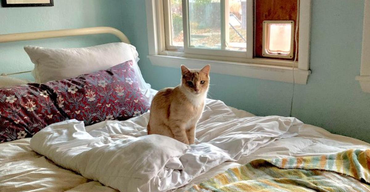
Creating a peaceful environment for your cat isn’t just about soft bedding and a quiet corner—color plays a surprising role in your feline’s sense of security. While humans process color differently than cats, the visual cues from soft, calming hues can influence their behavior, stress levels, and overall mood. Just like people, cats can feel overstimulated in harsh environments, so choosing the right color palette is a small but powerful way to support their well-being.
Cats are naturally sensitive to their surroundings, relying on nonverbal signals to determine whether a space feels safe. Certain tones can encourage calmness, help reduce anxiety, and even create positive associations with certain areas of your home—whether it’s where they eat, sleep, or watch the world go by. Unlike loud toys or new scratching posts, calming color schemes work subtly but steadily, contributing to an overall sense of peace.
In this guide, you’ll find 7 calming color palettes that help cats feel secure, each with its own mood and atmosphere. Whether you’re redecorating your cat’s corner or simply choosing a new blanket or carrier, these suggestions are practical, soothing, and aesthetically pleasing. Plus, we’ll also highlight 3 colors to avoid, so you can make informed, cat-friendly design choices for your shared space.
1. Soft Blue & Pale Grey
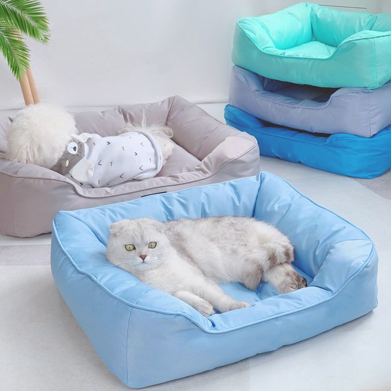
Subtle yet deeply comforting, soft blue combined with pale grey echoes the calm of a quiet sky on a cool day. This pairing promotes a serene atmosphere where your cat can decompress, especially in spaces meant for rest. These colors are particularly useful in bedrooms, nap spots, or elevated perches. Light blue has even been noted to slow breathing and lower tension in animals. Pale grey, when used in fabric or wall color, provides a cozy, den-like neutral that doesn’t overwhelm. Use this combo to gently signal that this is a safe, low-stimulation area. Together, they wrap the space in a cloud of calm.
2. Sage Green & Cream
Evoking the calm of a lush garden or quiet forest floor, sage green paired with creamy tones creates a grounding effect for your cat. This natural, earthy palette can encourage curiosity without triggering anxiety, making it ideal for areas where your cat plays or explores. Sage is particularly beneficial for cats that spend time near windows or plants, as it mirrors the tranquility of outdoor spaces. Cream softens the look and adds a gentle warmth, making the space inviting and calm. Try using these tones in soft furnishings or rugs where your cat lounges. The result is a balanced, nurturing vibe that feels instinctively safe. This palette is a favorite among cats who enjoy quiet observation.
3. Muted Lavender & Dusty Rose
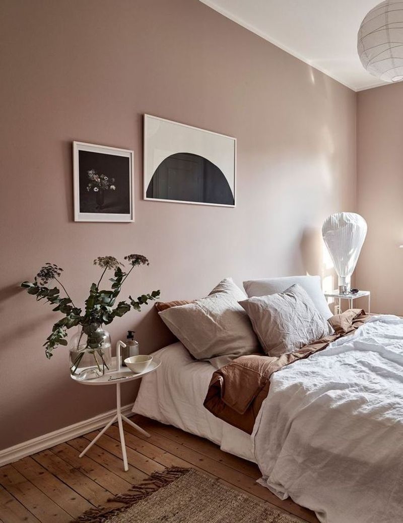
Introducing a slightly more romantic touch, muted lavender and dusty rose create an emotionally soothing duo that subtly eases tension. While cats don’t see these hues the way humans do, the soft intensity of these colors registers as non-threatening and non-invasive. These shades work beautifully in quieter zones—think under-bed nooks or sleeping areas. Lavender is also associated with calm in aromatherapy, and while we’re talking visual aesthetics here, the correlation supports its reputation. Dusty rose adds just the right amount of warmth to avoid the space feeling sterile. Try integrating these in textiles like throw blankets or cushioned carriers. It’s a dreamy combination perfect for feline serenity.
4. Warm Beige & Soft White
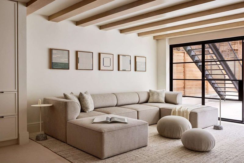
Neutral tones like beige and white may seem simple, but they’re quietly powerful when it comes to feline comfort. These shades create a seamless, low-contrast environment that doesn’t overstimulate or distract. Cats gravitate toward spaces that feel predictable and unobtrusive, and this duo delivers exactly that. Warm beige offers a sense of earthiness, while soft white keeps the space feeling fresh and light. Use this palette in places where your cat rests often, such as sofa corners or high perches. Their understated nature allows your cat’s senses to relax without dulling the environment entirely. It’s clean, calming, and perfect for multi-purpose areas.
5. Powder Blue & Sand
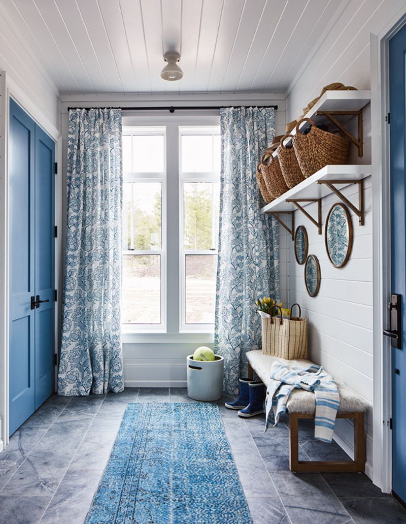
There’s something naturally soothing about the mix of powder blue and sandy tones—it’s like a coastal breeze in color form. This palette is ideal for cats who need encouragement to relax in newer or shared spaces. Powder blue offers a cool, tranquil foundation that visually quiets a room. Sand adds a grounded, sun-warmed balance that makes any area feel safe and stable. This duo is especially helpful in areas where your cat may feel vulnerable, such as near entryways or around feeding stations. Integrating these shades through mats or curtains helps ease transitions and build positive associations. It’s a gentle invitation to let their guard down.
6. Pale Peach & Ivory
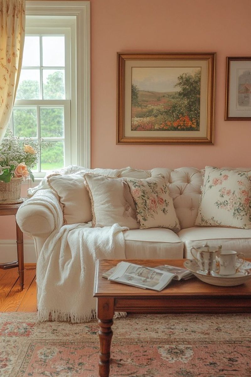
Pale peach carries a soft, nurturing tone that feels warm without being visually jarring—perfect for cats who like to burrow or hide. Paired with ivory, this palette becomes a gentle hug in color form. These hues are ideal for bedding, cat tents, or the lining of a cat carrier, where comfort and calm are essential. Ivory keeps things light, while pale peach adds a subtle touch of coziness without overpowering. The combo is especially good for skittish or recently adopted cats who are adjusting to a new home. Use it sparingly in areas you want them to associate with security. These tones help build familiarity through calm repetition.
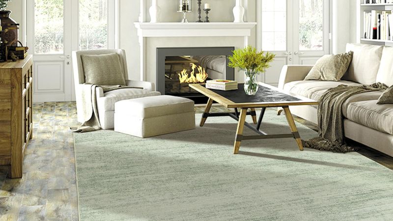
7. Cool Mint & Light Taupe
Fresh and understated, cool mint brings a slight touch of liveliness while still promoting peace. When matched with light taupe, the space feels grounded and clean without any harsh contrast. This palette is great for active cats who still need downtime, offering a sense of calm without dulling their environment. Light taupe acts as a visual anchor, making rooms feel cohesive and secure. Cool mint introduces just enough color to spark interest without overstimulation. It’s an excellent palette for playrooms or window-side rest spots. The subtle contrast keeps the area visually appealing but still low-key for feline comfort.
8. Bright Red (Avoid)
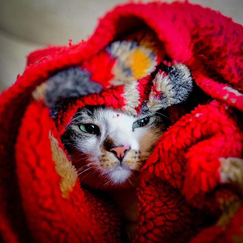
Bright red might be a power color for humans, but for cats, it can be visually intense and emotionally unsettling. Though cats don’t perceive red the same way we do (they see it as a duller shade), the contrast and vibrancy of red objects still create a strong visual stimulus. High-intensity shades can raise stress levels and even discourage exploration. If you’ve noticed your cat avoiding a certain pillow or toy, its color could be part of the reason. Red tends to signal alertness or danger in nature—traits that don’t exactly invite relaxation. Avoid using red in areas meant for calm, like sleeping spots or litter areas. Instead, reserve it for high-energy play toys—if at all.
9. Neon Yellow (Avoid)
While neon yellow may feel energetic and modern in a design sense, for cats, it’s a visual overload that can create discomfort or agitation. Cats are more sensitive to movement and contrast than to color, so bright, glaring hues stand out in a way that may feel harsh or invasive. In well-lit areas, neon yellow can appear especially overpowering. It’s also one of the least natural colors in their environment, offering no soothing associations to draw from. Cats tend to prefer muted, earthy, or pastel tones that mimic nature. Using neon yellow in bedding, carriers, or litter spaces could lead to avoidance behaviors or reluctance to settle. For feline-friendly style, stick to gentler, less demanding shades.
10. Stark Black & White Contrasts (Avoid)
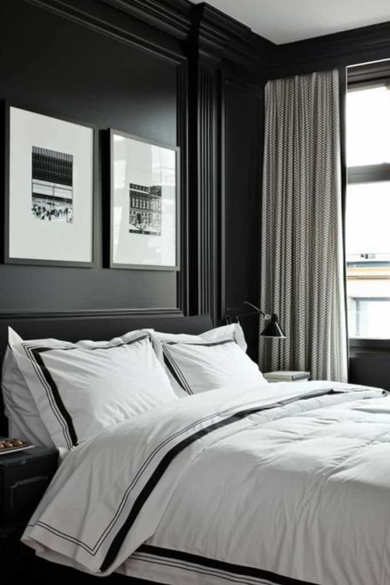
High-contrast combinations like black and white can be visually jarring to cats, creating a chaotic or confusing space. While cats can’t see the full spectrum of color, they are highly tuned to light and shadow, making these contrasts feel like sharp boundaries. Such stark visual environments can break up a cat’s sense of flow or territory within a room. The dramatic difference between the two tones can come off as unnatural and disorienting. If your home décor includes these combos, try softening the look with intermediate tones like greys or off-whites. This will help reduce visual tension and create a more inviting space. While not inherently bad, black-and-white needs careful use when designing calming zones for your cat.